Well hello, Warrior! It’s great to see you on a Thursday! I’ve got a bonus post this week because my little corner of the internet and social media has some new branding! And I had to share it with you! In case you couldn’t tell, I’m excited.
A few years ago, I purchased a made-for-me logo via a seller on Etsy. And after all the revisions, it just felt off. It looked a bit too busy and didn’t quite communicate what I wanted it to. It didn’t translate well on the blog either, so I ended up only using it as the cover art for my Facebook page.
While my little blog isn’t the powerhouse that some others are, it and my social media channels have grown a bit since then, so I decided it was time to try this whole logo thing again. I went in with a clearer idea of what I liked and wanted and purchased a package from a seller on Fiverr (highly recommend this site for all sorts of branding needs, btw). And I might love my logo a little bit.
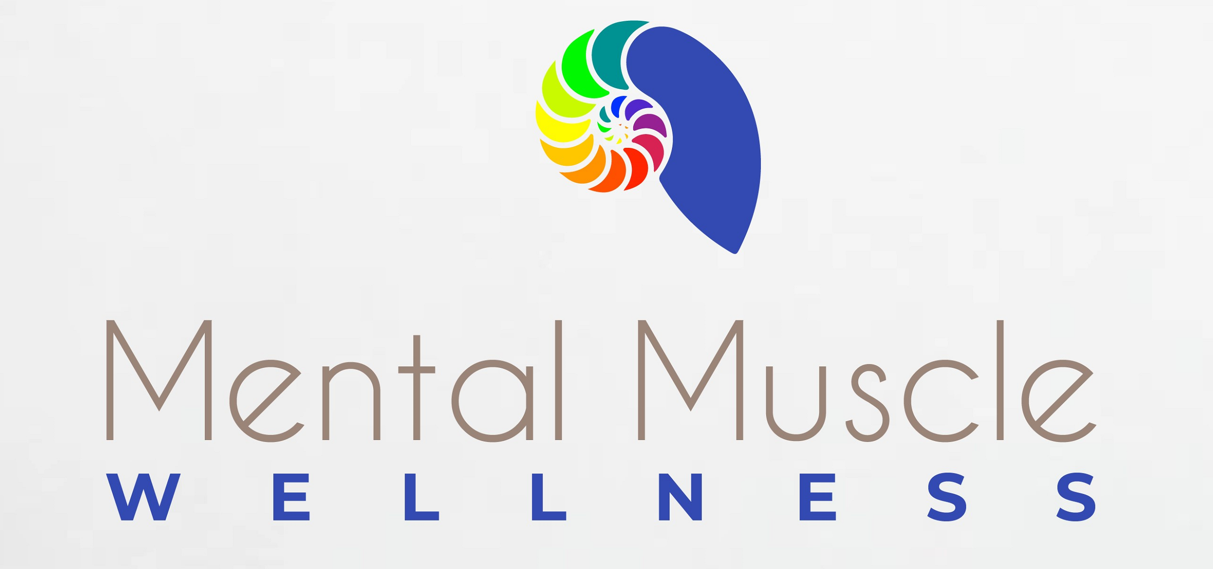
You might be wondering why I chose a shell, especially because there isn’t much nautical going on with my site. The shell I chose is specifically a nautilus. And it’s actually a pretty powerful symbol.
First, the nautilus grows in a circular spiral that conforms almost perfectly to the golden ratio and the Fibonacci sequence. If you’ve been around, you know I am a science nerd, so anything that reps that is something I can appreciate. Also, bonus exercise humor for the use of “reps.”
Second, as the nautilus grows, it creates larger chambers, vacating the too small ones. However, the small chambers still serve very important purposes for buoyancy and how the nautilus lives. The nautilus is a deep sea dweller and can withstand very high pressures. Additionally, when many other types of deep sea creatures will die due to pressure change when brought to the surface, a nautilus will not. A nautilus’ shell is typically smooth and matte when viewed from the outside. It is only after it is dissected and cut open that the mother-of-pearl iridescence and chambers can been seen.
More science, yes, but also some important metaphors for personal growth. As humans we are constantly changing and the best things happen when we realize the value of our past in shaping who we are and who we might become. Adapting to pressure allows us to navigate stressful situations and come through stronger. And true beauty is always found on the inside.
Third, I chose to color the different shell segments in the logo in the ROY G BIV order because it underlines the connection to the Dimensions of Wellness that I enjoy focusing on. DOW models often use this type of coloring to show the interacting nature of the different dimensions. Additionally, the rainbow is often a symbol of diversity and inclusion, something I’d like to focus on more.
So, how will I be using this? Well, obviously, it will be the new header for the blog. Additionally, you’ll see a version of the logo on my social media banners as well as single color shells on my Instagram Story Highlight Covers.
In addition to the new logo, you can use the hashtag #mentalmusclewellness on social media, too! If you aren’t following already, you can find me @mentalmusclewellness on Facebook, Instagram, Pinterest, and YouTube. Use it to share your own Physical, Mental, or Emotional Health practices and journeys. Or use it to share some tidbit of info you think this community might find helpful.
And until next time, be well friends!
0

